

Analytics
Overview
This dashboard provides comprehensive analytics about platform performance, including viewership statistics, geographical distribution, platform usage, and content consumption patterns. The dashboard consists of various "Cards" or metrics, each providing specific insights into different aspects of the platform's performance. Analytics update daily at 5am ET. This data is not realtime.
Accessing the Dashboard
When you select ANALYTICS on the left navigation in Backstage, you'll automatically be directed to the Analytics page and the default dashboard will be displayed.
Dashboard Controls
Date Range Selection
Located at the top of the dashboard, you can select your desired date range in two ways:
Relative Dates: Pre-set date ranges (e.g., Last 30 days)
Custom Dates: Specify exact start and end dates for your analysis
Note: The Default Date Range on a piece of media is the last 30 days and cannot be adjusted at this time. The customization of Default Date Ranges will be available in the next Backstage release.
Key Metrics Explained
Viewership Metrics
Live Views: Count of live stream sessions within the selected date range (each time a user starts watching a live stream counts as one view).
Live Hours Delivered: Total hours of live content watched within the selected date range.
Live Average Watchtime: Average session length within the selected date range for users on media marked by the platform as Streaming Type of “Live”.
Total Hours Delivered: Total hours of live and video-on-demand content watched within the selected date range.
VOD Views: Count of media plays marked by the platform as Streaming Type of “Video-On-Demand” within the date range (e.g., watching 3 episodes counts as 3 views).
VOD Hours Delivered: Total hours of video-on-demand content watched within the selected date range.
VOD Average Watchtime: Average amount of minutes watched across all VOD content within the selected date range.
Daily Totals
The bar graph displays daily hours delivered, providing a visual representation of viewing patterns over time.
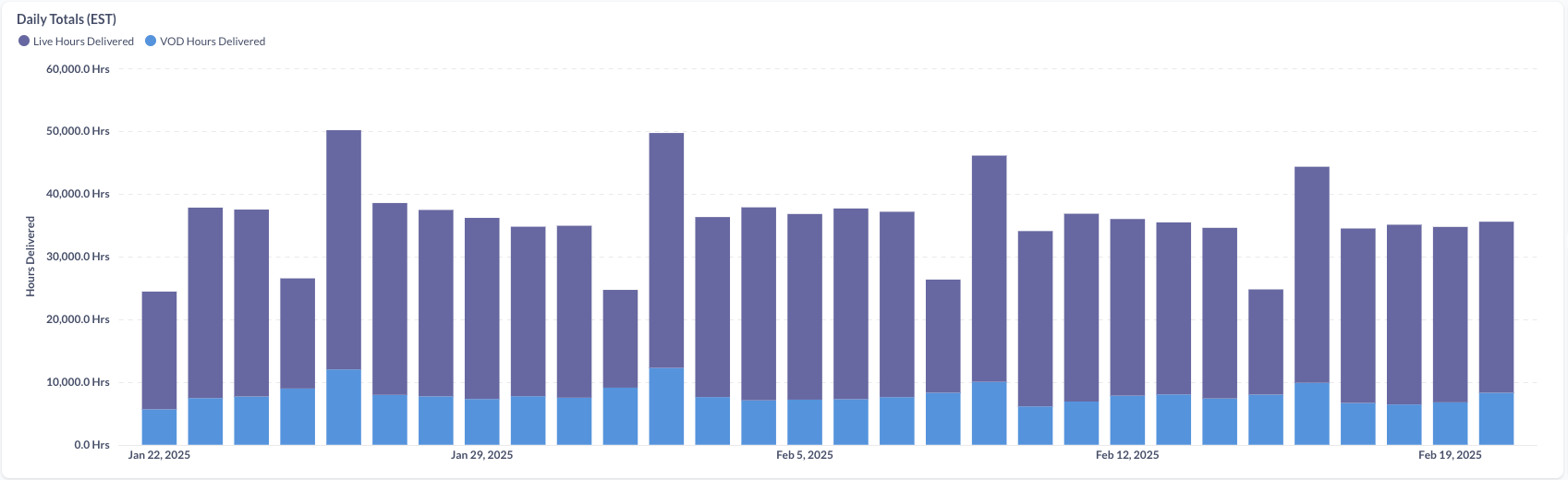
Tip: Hover over individual bars to see hour information for a specific date.
Total Assets Analysis
This section shows all assets based on performance (both VOD and Live) within your selected date range:
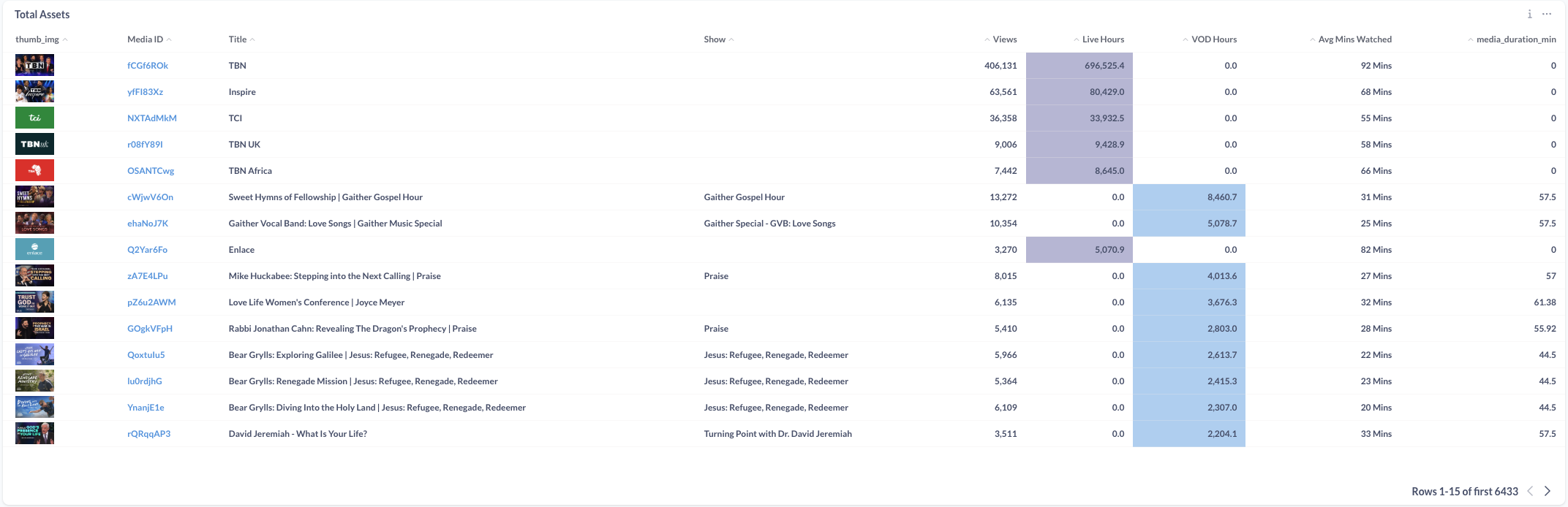
Tip: The default sorting is by Total Minutes Watched. Sorting by any other metric (e.g., VOD Hours) can be accomplished by clicking on that metric to sort. To reset to the default sort you will need to reload the page.
Device Share Visualization
This dual-ring pie chart visualization provides platform usage insights by views as well as by hours:
Inner Ring: Shows the distribution of total views or minutes consumed across different platforms
Outer Ring: Breaks down the type of content (Live vs VOD) consumed on each platform
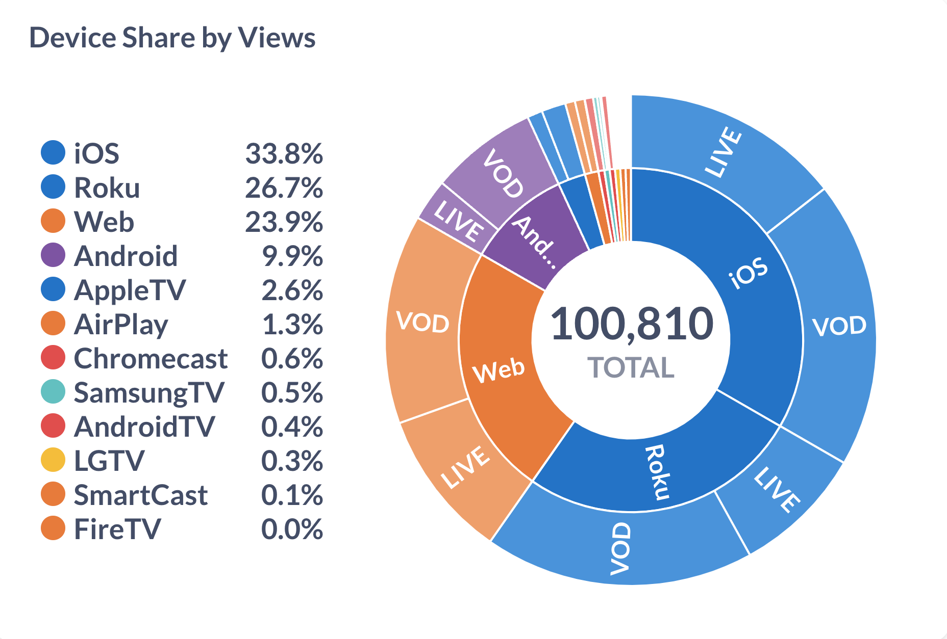
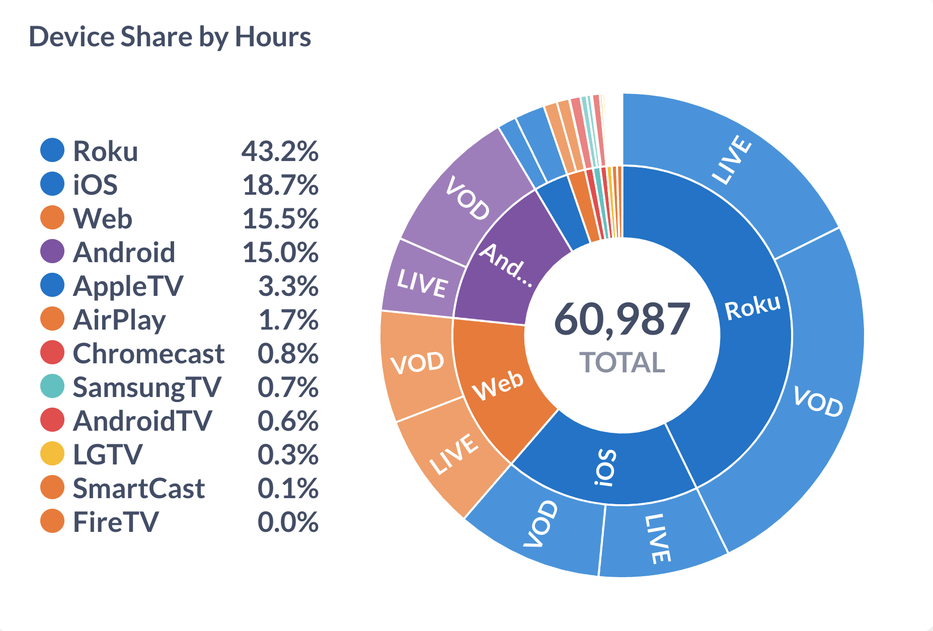
Tip: Hover over individual Platforms and Content Types to see their specific data.
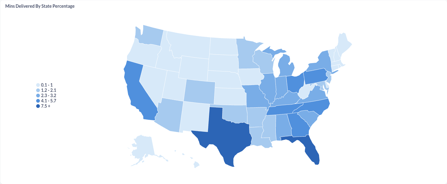
Geographical Distribution
The card includes two geographic visualizations where in both maps, darker blue shading indicates higher percentage of viewing minutes in that region:
Minutes Delivered State: US-specific heat map showing state-by-state viewing patterns
Minutes Delivered Country: Global heat map showing worldwide viewing distribution
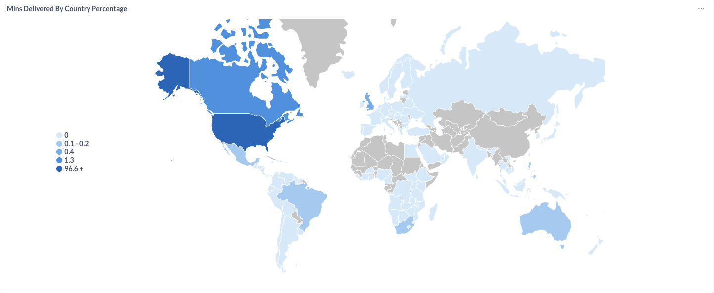
Tip: Hover over individual Countries and States to see their specific data
Last updated